Cultura
Development of a mobile app designed to assist cultural events in generating more attendance towards their programs, to help preserving cultural heritage.
Role
Research
UX/UI Design
Graphicdesign
Prototyping
Duration
10 days as a team
5 days for revision
Team
Team of 3 UX/UI Designers
Year
2023
PROBLEM
Cultural events are failing to fulfill their mission of preserving cultural heritage due to consistently declining attendance.
SOLUTION
Providing easy access and comprehensive information to enhance the overall awareness of cultural events and promote cultural interest in general.

Secondary Research
At the outset of the project, we conducted secondary research to gain an overview of the topic and to explore potential reasons for the declining number of visitors and the perceived lack of societal interest in culture. In this regard, we identified the following points as particularly prominent and relevant:
Marketing
Poor marketing strategies or a lack of effective promotion can lead to low awareness and visibility of cultural institutions and their offerings.Lack of Diversity and Inclusion
Cultural institutions that do not cater to diverse audiences or fail to address the interests of underrepresented communities may see a decline in visitor numbers.Targeted Outreach
Certain demographic groups or older audiences may still prefer printed media and respond positively to brochures, flyers, newspaper ads, and cultural magazines.However, these marketing tools also fail to reach younger target audiences who primarily consume content digitally.Accessibility and Infrastructure
Issues related to accessibility, including physical access, transportation, and facilities, can deter potential visitors, especially those with disabilities.
Interviews
Based on the results of our research, we created a questionnaire to help us validate our assumptions and hypotheses regarding possible triggers and to gain a deeper insight into how to address the declining visitor numbers. The following points were raised most frequently by the respondents:
Marketing
Cultural institutions face criticism for relying on outdated marketing methods, such as print media, and occasional use of social media, which fails to engage diverse target audiences. Respondents express frustration at the lack of reliable information on cultural events and find it challenging to access such information efficiently.Social Component
Our interviewees enjoy attending cultural events with others, often learning about them through recommendations. Poor information sharing by some groups leads many to miss out. Additionally, people often lack like-minded companions for these events. Potential participants in cultural events often feel put off by the fact that they cannot find ratings and reviews from like-minded people with whom they can identify.
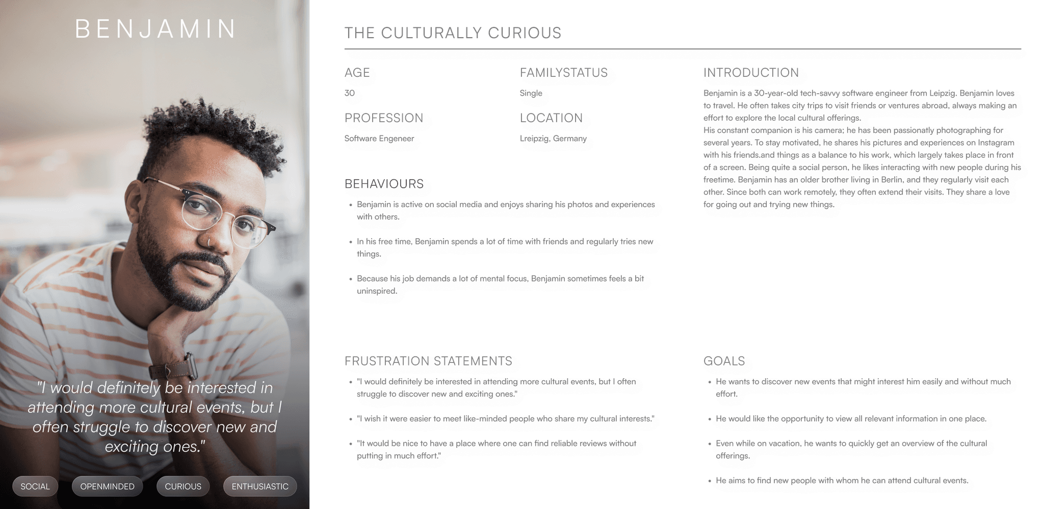
Persona and User Journey Map
Based on the results, we created a persona to represent our target audience and their potential challenges. Our persona was named Benjamin.
Using a User Journey Map, we depicted Benjamin’s emotions throughout the process of engaging with a cultural event. This allowed us to identify potential opportunities within the process that our product could address.By mapping Benjamin’s emotions and identifying these potential opportunities, we gained valuable insights into how our product could enhance the entire user journey, from discovery to post-event reflection. This approach helps us create a more tailored and meaningful experience for users like Benjamin, ultimately increasing engagement and satisfaction with cultural events.

Problem Statement
Based on our insights from user interviews, the creation of our representative persona, and the depiction of their challenges in the User Journey Map, we formulated a concise problem statement intended to provide guidance for the subsequent ideation process. The problem statement reads as follows:
People receptive to cultural events often lack participation due to limited information access and outdated promotion strategies neglecting many demographics.
Structuring the insights
In order to organize and categorize our impressions and then define possible solutions, we created an affinity diagram in the next step. The Affinity Diagram reveals multiple factors limiting the appeal of cultural events to a wider audience. Inadequate marketing, focusing on an exclusive audience rather than the societal cross-section, is a key issue. The reliance on self-initiative to explore cultural offerings makes discovering new experiences challenging. Social and physical accessibility are also major concerns, leading to underrepresentation of social groups and hindering participation for those with physical limitations due to insufficient measures and information.

The ideation process
In the ideation phase, we worked with the crazy eight method to develop a wide range of different solutions. We then carried out a dot voting to evaluate the ideas generated. This allowed us to identify promising concepts that resonated most with our team. In a second iteration, we expanded on these selected ideas to further develop and refine their potential solutions.
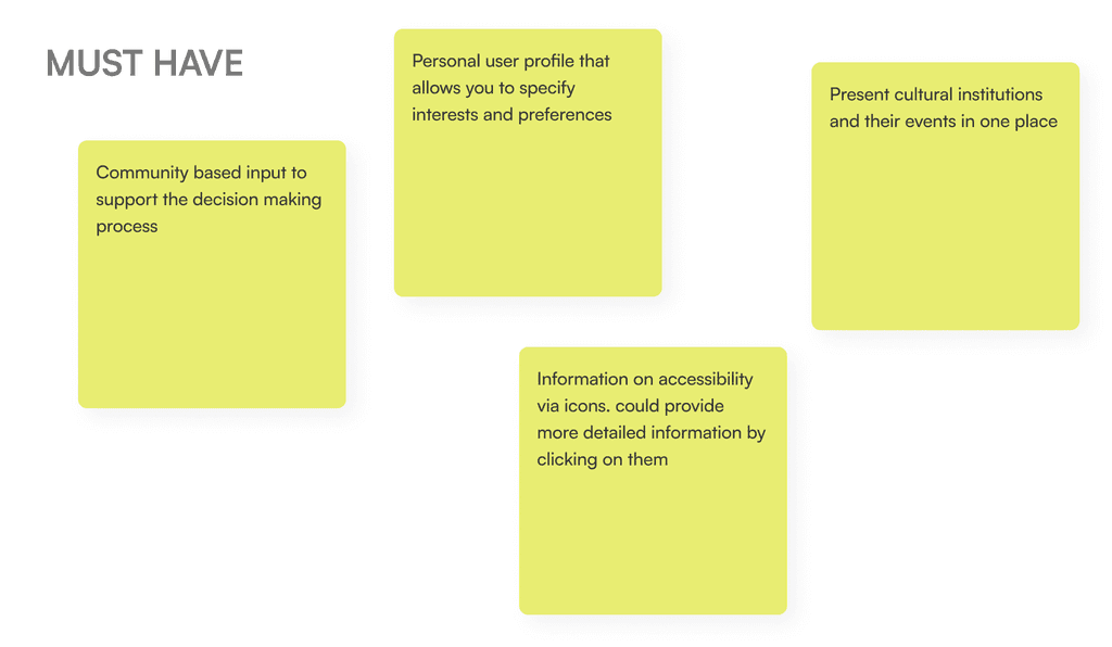
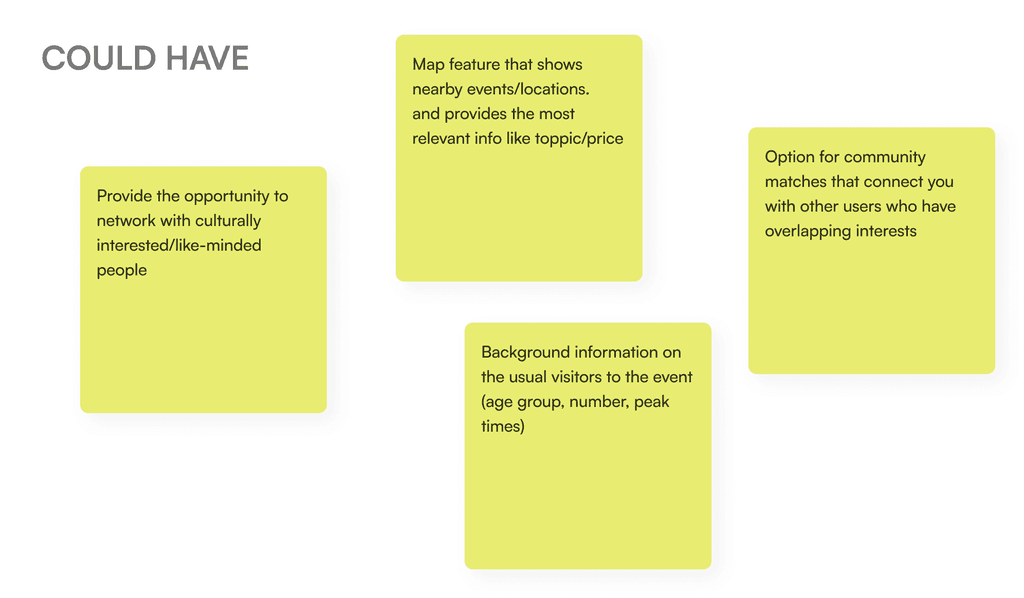
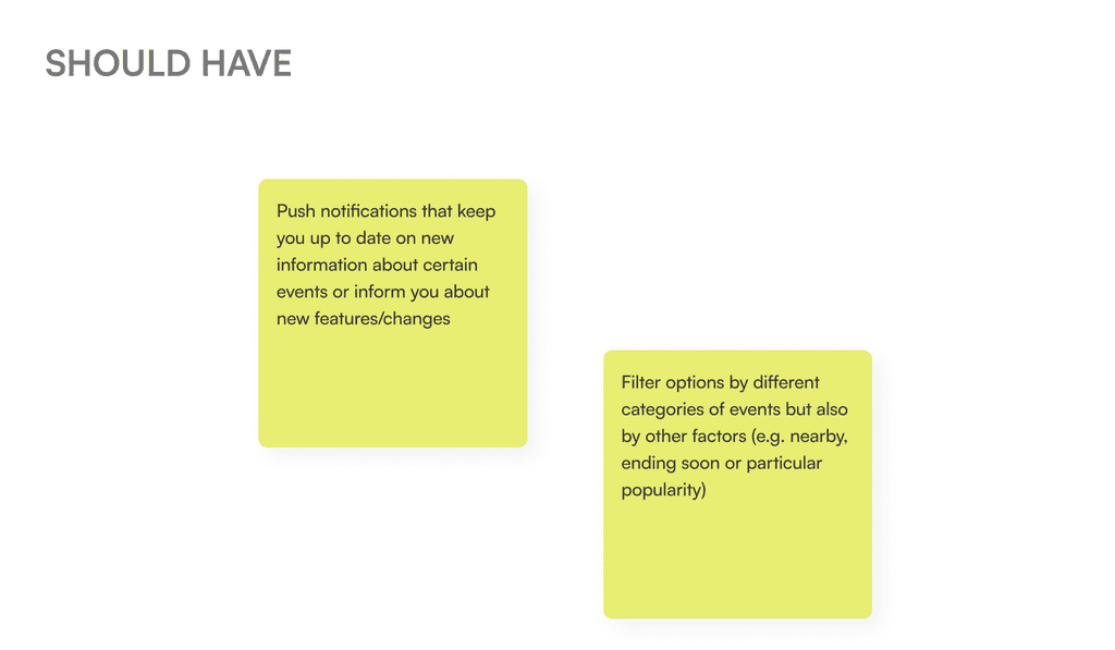
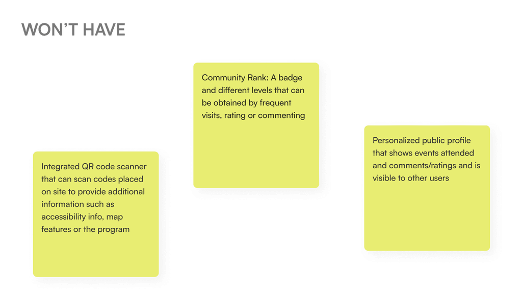
Utilizing the MoSCoW Method, we categorized the most pertinent ideas and features into four distinct groups: Must Have, Should Have, Could Have, and Won’t Have. This classification process helped us prioritize and allocate resources based on the importance and feasibility of each feature.


Defineing the Goal
Our resultant app aims to be a comprehensive solution for enhancing engagement with cultural events. It will be a dynamic platform that allows users to seamlessly navigate through the cultural landscape. Must-have features include displaying institutions and their events, offering accessibility information, and enabling community interactions through likes and ratings. Personal user profiles will cater to individual preferences and interests.
In future development states the app could also connect users with similar interests, helping them meet at events and receive push notifications for personalized event recommendations. It could also feature a map showcasing nearby events. With these features, the App strives to create an immersive cultural experience, fostering connections and enriching engagement for users.
The MVP Userflow
In the next step, we designed a user flow chart to illustrate the journey leading to the “AHA-Moment” in using our MVP. We distinguished between two distinct processes, that led us to identify the most relevant screens that we wanted to include within our initial MVP prototype:
The first branch depicts the path of a user who utilizes the app without creating a personal profile. Without registration, and only by sharing their location, the user can view cultural events within the app’s feed. However, these events are not filtered or structured according to personal interests. Features such as liking and saving events, as well as rating, are only accessible after creating a personal profile.
The second branch illustrates the journey of a user who creates a personal profile. By specifying interest fields within their profile, the user receives personalized content in their feed. Furthermore, they can use the like button to save interesting events to their list of interests and provide ratings.

Screen Development
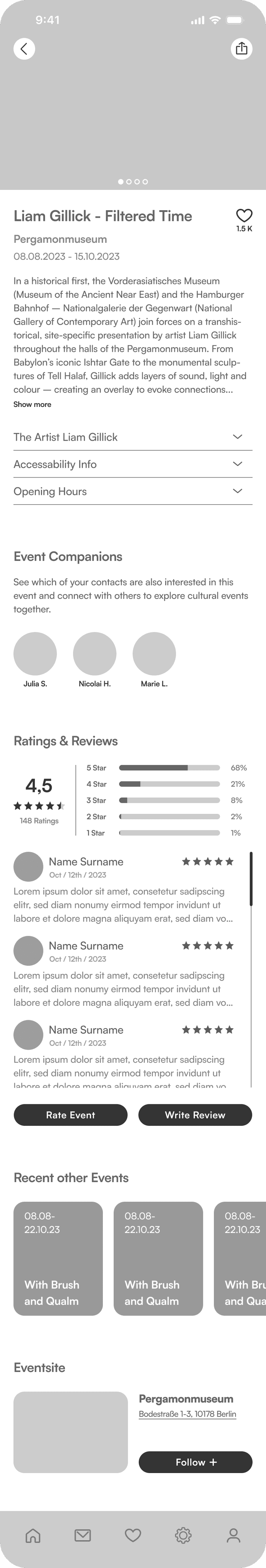
Based on rough hand sketches, we quickly transitioned to digitally rendering the screens, making it easier to estimate dimensions and play with positions and color gradients. Between each development stage, we conducted user tests to ensure that we created a user experience that was understandable. The screens below show the development process from an initial low-fidelity variant through an iteration round to a mid-fidelity screen, which was then converted into a high-fidelity screen using our styletile. This process is shown using two screens as examples: the main feed, the heart of our app, and the detailed view of an event, which forms the most complex screen of our app.
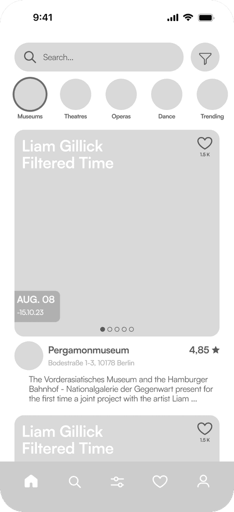
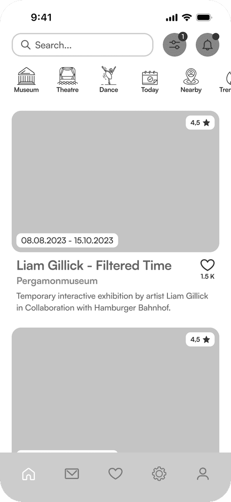
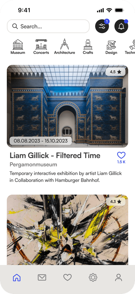
Main Feed Development
The main feed is the focal point of our app. It was crucial for us to create an optimal balance between information richness and clarity. In the design process, we applied the 4pt grid system to ensure consistent spacing.
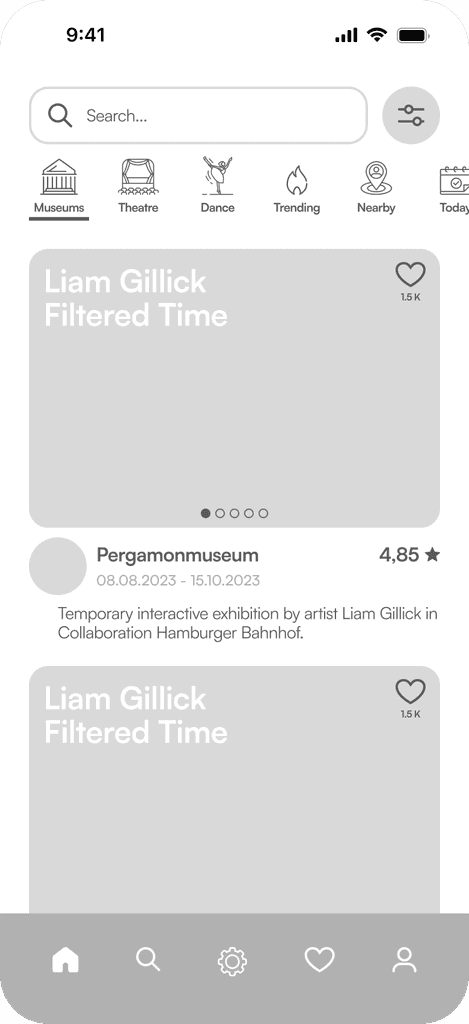
Enhanced Differentiation
To increase differentiation between fields requiring input and buttons, we adjusted the shape of the text fields. This change also affected the search bar in the main feed, which transitioned to rounded rectangles, while buttons remained fully rounded.Content Quantity Optimization
The individual components of the screen were rearranged to convey the highest possible information content without overwhelming the user with a cluttered interface.Improved Information Structure
To improve the readability of content, we repositioned the event title beneath the thumbnail view of event images and placed the Like button next to it.
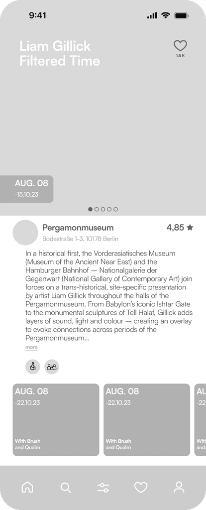
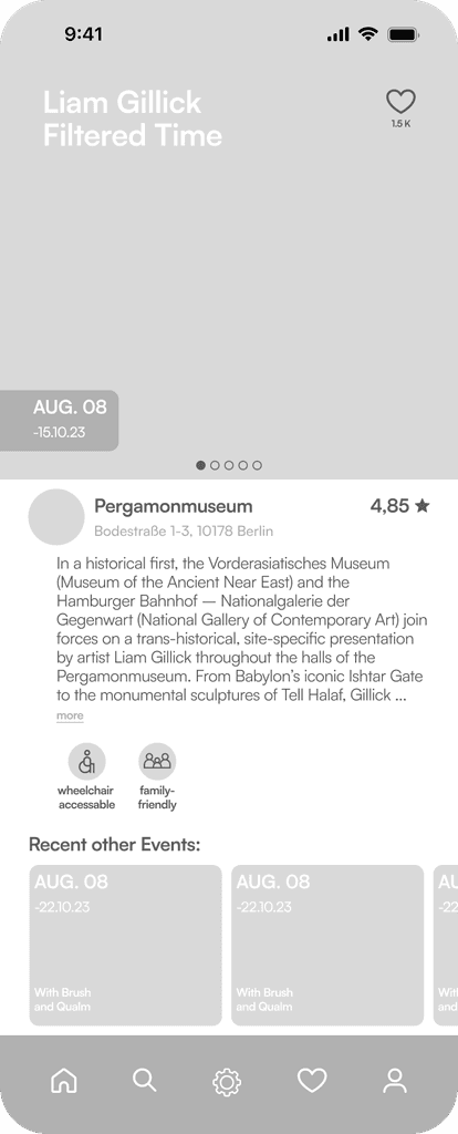
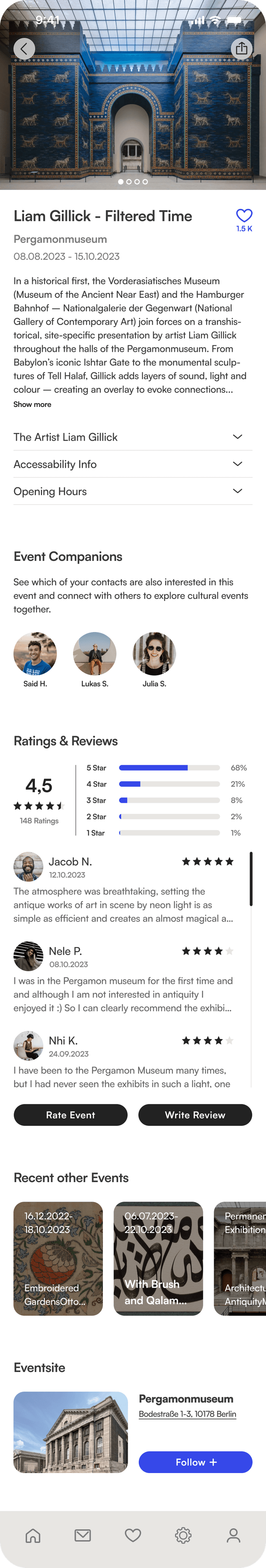
Event Screen Development
The detail view of events was continuously expanded in the process to include additional features. By applying the 4pt grid system, we were able to establish a vertical structure that made it easy to comprehend the high information content of the screen.
Prevention of Information Overload
To avoid overwhelming the user, opening hours, artist profiles, and accessibility information were placed in dropdown menus. The icon labeling for accessibility icons, identified as necessary after initial user tests, was of course retained.Insight into User Reviews
We housed user reviews in a separate scrollable section within the event details. The breakdown of the overall rating allows users to filter through individual reviews.Introducing the Relevant Institution
Instead of positioning the institution hosting the event as a small avatar below the images, we provided a dedicated space within the event details. Additionally, we added the option to follow the event site.
THE HIGH-FIDELITY PROTOTYPE
The result of our process was the final high-fidelity prototype of the Cultura App. The animations listed below guide through the individual screens included in our prototype.
Structured profile creation in just a few steps
An important part of our user flow was to create a profile on the basis of which the feed can be individualized.
Intuitive usage
The text fields have been designed and animated in a way that it is unmistakably clear whether the field has to be filled in, is in active state or already has been filled in. Active and passive states of the buttons indicate when processes have been sufficiently completed.Progress indication
The animated progress indicator visualizes the progress of the profile creation process and motivates the user to complete all steps.
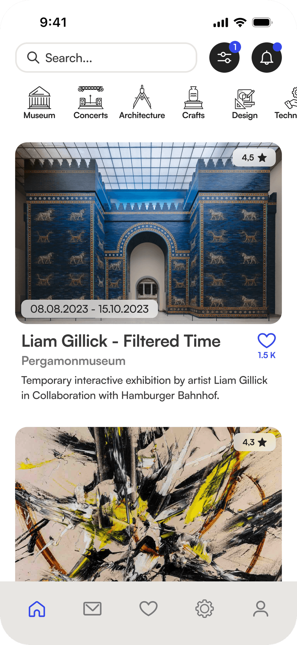
A well-organized feed that invites you to explore
All relevant information in one place
The detailed view of an event contains all relevant information about the event and provides insight into visitor ratings and contacts who are interested in this event
Visitor ratings
Insight into reviews helps in decision-making, but of course, one can also share their own opinion.Join your friends
See which of your friends are also interested in the event and easily get in touch through the messenger, because experiencing culture together is more fun.Stay informed
Users can follow institutions, to get informed about their program. Furthermore, within the event details, one can also see what other current and future programs the cultural institution has to offer.Save events
Just like an event, and it will be saved. You will then be provided with information about this event. Past events can be easily accessed with a simple swipe, in case you want to revisit or need information.
Your personal Profile
Outlook for future development
In future versions, for example, the social community features could be expanded further, so the app could also provide the option of searching for new friends to attend cultural events with outside of one's own contacts, so actively posting requests for "cultural buddies" would be a potential development step. In addition, it would also be possible to integrate a kind of forum in which users can exchange information about areas of interest or form groups that they can join in order to exchange information about topics of interest or take part in events together. Another possibility for further development would be to provide additional materials or information for the listed events, such as audio guides in different languages.
The ideation process
In the ideation phase, we worked with the crazy eight method to develop a wide range of different solutions. We then carried out a dot voting to evaluate the ideas generated. This allowed us to identify promising concepts that resonated most with our team. In a second iteration, we expanded on these selected ideas to further develop and refine their potential solutions.
Following the initial ideation phase, it became evident that the product, the ultimate goal of our process, should take the form of an app designed to enhance navigation within the cultural landscape and elevate awareness and engagement with cultural events.
Utilizing the MoSCoW Method, we categorized the most pertinent ideas and features into four distinct groups: Must Have, Should Have, Could Have, and Won’t Have. This classification process helped us prioritize and allocate resources based on the importance and feasibility of each feature.