Sky Go
Redesign of the Sky Go app based on the use case of discovering exciting, personalized content with emphasis on a refined and streamlined user experience and a reworked interface.
Role
Research
UX/UI Design
Graphicdesign
Prototyping
Duration
4 days
Team
Solo Project
Year
2024
PROBLEM
Due to the lack of decision-relevant information, in combination with the lack of any form of personalization, it is difficult for users to find content that matches their preferences. In addition, there is a confusing structure and unclear interface elements that make it difficult to navigate within the app.
SOLUTION
Provide the user with tailored content and all decision-relevant information within the app to improve the user experience while creating a simplified and easy-to-understand interface design and optimized user guidance.

Introduction
The aim of this project was to analyse an app regarding one of its use cases, identify deficits and then prioritize these according to relevance considering the selected use case. In a further step, solutions for the problems identified should be developed and elaborated as a redesign in the form of a high fidelity prototype. It was important that the visual identity of the app was retained and that it remained clear which product it was. I quickly decided to investigate the Sky Go app for this project, as I had already used the app and had noticed some potential for optimization. I decided to tackle the following question as a usecase:
How can I help Sky Go app users to find exciting, new content that matches their interests?
Analysis of the Use Case
As a user of the Sky Go app myself, I was already aware of some of its shortcomings and areas for improvement. However, until now, I primarily used the app on the TV, where the interface and menu navigation are significantly different from the smartphone app. During the testing phase, I tried to go through all the relevant and possible steps that were pertinent to my predefined use case.
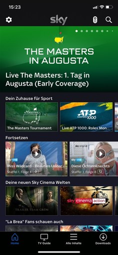
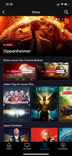
The Homescreen
On the Homescreen, users are presented with a mix of on-demand content, combined with sports and live TV offerings. The Homescreen also displays content that users have started but not finished. Since there's no option to create independent accounts, this section showcases ongoing content for all users under a single account. Sky Go entirely avoids algorithmic analysis of user preferences. This means all Sky subscribers receive the same recommendations, unrelated to their personal interests and preferences.
Missing user profiles
Users under one account cannot create independent profiles.Enhanced differentiation
On the home screen, there's no option to apply filters to on-demand content.Unpersonalized content
The individual components of the screen were rearranged to convey the highest possible information content without overwhelming the user with a cluttered interface.Misplaced filter options
Filters are placed at the bottom of the screen, and can just be applied to TV Content
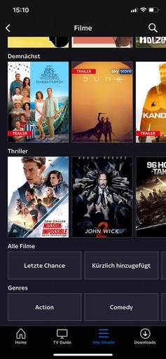
Applying Filters
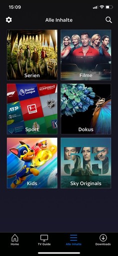
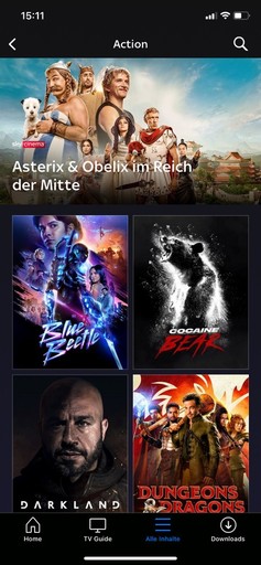
To apply filters to on-demand content, the user must tap on "all content" in the navbar. The icon used for this is already misleading as it's typically used as a menu icon. The displayed categorization is also confusing, as documentaries, sports, Sky Originals and children's content could potentially be found in both the movie and series categories. If the user then selects "movies," they have to scroll through an entire screen of unpersonalized content before finding the filter options at the bottom of the screen. After applying a filter, the user is directed to a third screen where subcategories are entirely omitted.
Complex structure
There are unnecessarily many screens to navigate through and the categorization of content is not understandable.Misplaced filter options
Filters are placed at the bottom of the screen, making them less accessible. Additionally, filters cannot be combined with each other.
TV Content
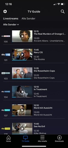
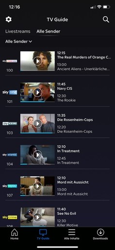
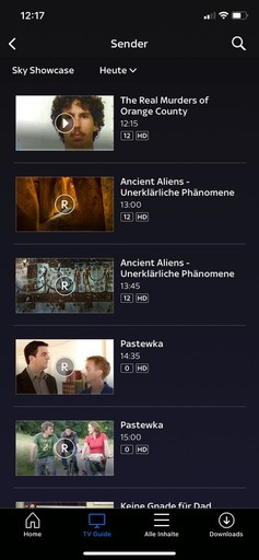
The TV Guide provides an overview of the channels available within the Sky Go app. Users always see the current program on each of the channels. To view the upcoming schedule, users can tap on the logo of the respective channel. The screen is divided into "Livestreams" and "all channels," but both sections display the exact same program.
Superfluous classification
The two menu items at the top of the screen ( Livestreams and All channels ) do not differ in their function, both show exactly the same program.Insufficient overview
One can only see which show is currently running and what comes next, but it is difficult to see which content is actually running in parallel to each other in the course of time on different channels.Complex user guidance
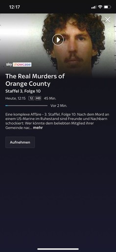
To get information about a current show or the option to record a show, the user has to navigate through 3 screens, which makes the process unnecessarily complex. In addition, the fact that all screens look extremely similar makes orientation even more difficult.
Content Details
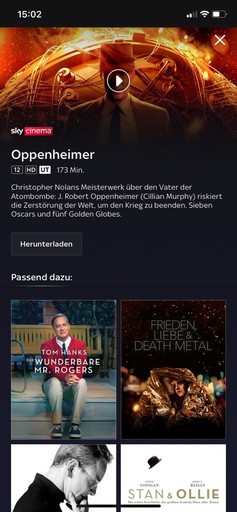
On the detailed view of series and movies, nearly all crucial decision-making information is missing. Users can neither view information about the cast nor about the director. There's also no option to watch a trailer. There's no traditional button to start playback; instead, only a play icon is present on the content's banner. The only button used is a download button, which is designed in a way that it appears inactive.
Incomprehensible and missing buttons
The button appears inactive, and there's a complete absence of a play button. Movies can only be played through the icon on the banner.Missing information
There's no option to watch a trailer, and relevant information about the director, cast, genres, and ratings is also missing.Missing Watchlist
There's no option to save content to a watchlist for later viewing
Prioritization of the challenges regarding the use case
Based on my analysis of the existing Sky app, I was able to identify the following three points that significantly detract from the user experience regarding the use case of discovering exciting content within the app.
Lack of Information
To identify suitable content, users need information in the form of ratings, trailers, or details about the cast and director. There are already numerous examples of incorporating such features, and with minimal effort, a significant improvement in UX can be achieved.Personalization of Content
Currently, there is no personalization of the displayed content. Essential for this is the ability to create separate user accounts and also the algorithmic processing of information.Refinement and Restructuring
The app is hard to navigate with complex processes. For genre filtering, users must navigate through three screens. Ambiguous icons, like the "All Contents" withinthe Navbar, and filters consistently placed at the screen's bottom reduce UX.
Development process
Due to the tight timeframe, I immediately began working digitally. Using screenshots from the app as a reference, I created a set of components that I could easily modify. The goal of the process was to create a redesign that preserves the app's original visual identity, ensuring it remains clear which product it represents. I made subtle changes to maintain the style of the Sky Go app. From the newly built components, I assembled the individual screens in the next step and created an interactive prototype from them.
THE REDESIGN OF SKY GO
The result of the redesign process is an interactive prototype. The most relevant features are presented and explained below in short videos.
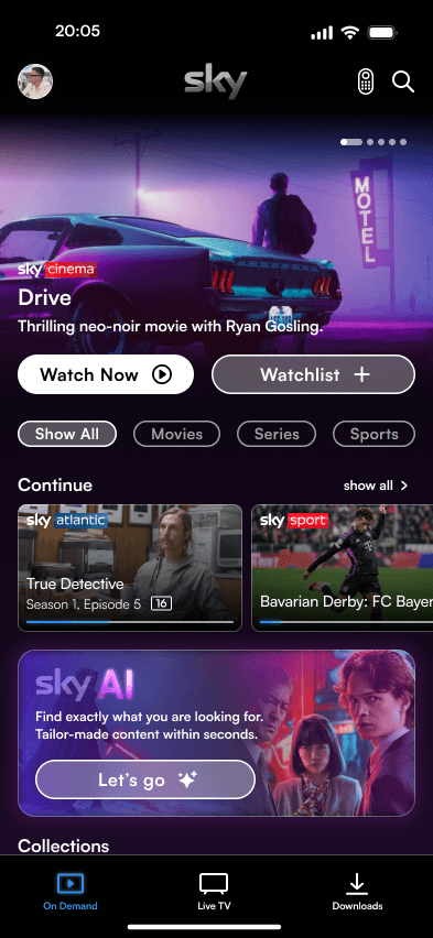
Better overview and clear structure
The "all contents" option in the navigation bar has been removed, instead of a home screen, a distinction is now only made between Live TV and On Demand content, the download section of the navigation bar has been retained. In order to be able to personalize content for different users of the same account, the option to create user profiles has been integrated. The filter options were previously located at the bottom of the screen, now they are easily accessible right at the top.
Simplified filter options
Easy way to filter content directly at the top of the pagePersonalized content
Content and categories displayed are based on interests and previously viewed and approved content.Navbar redesign
The navbar has been simplified and the individual Icons have been redesigned and the sections have been renamed for better understanding.
A new way to discover movies
After using the movie filter, you can now directly select a genre, eliminating the need for three separate screens. Previously, unfinished content was only shown on the home screen. Now, filters apply to started content as well. Collections recommend themed content based on user preferences and viewed content. The detailed view lacked essential information like language settings, subtitles, trailers, ratings, and details about actors or directors. Additional features such as the ability to save content to the watchlist or a category of recommendations based on a combination of one's own taste with the preferences of another user on the same account have also been added.
All the info you need
Trailers, ratings and all other relevant information can now be viewed directly and easily.Enjoying movies together
A major innovation are suggestions based on a combination of the interests of different users of a profile, because films are best viewed in company.The Watchlist
An essential feature missing from the Sky Go app was a Watchlist, he missing button has now been added; saved content can then be viewed on the profile page.
An enhanced TV experience
The Live TV section has been completely redesigned, the program is now displayed on a movable timeline, so you can see exactly where what is on at what time. The option to favorize channels allows you to access exciting content even faster. Filters and a date specification make it possible to search more specifically and plan which content you want to record in the long term.
Improved layout
The new timeline on which the program is presented simplifies navigation and provides a better overview.Improved layout
Faster access to your favorite TV channels.See what's on tomorrow
Date filters give you a better overview and help you plan ahead.
Content tailored to you- within seconds
Another significant innovation is the Sky AI. Finding interesting content has never been easier. By voice or manual input of a prompt, the AI suggests tailored content in seconds. The more precise the prompt, the more specific the recommendations will be.
The Sky AI
Integrated AI tool that assists with movie selection and provides tailored recommendations.Background information
The detailed view of the respective movie also informs the user why the movie was selected, for example based on previously watched or liked movies .
Outlook for future development
The Sky Go app has significant room for improvement and untapped opportunities for optimization, as highlighted during this project. While my current focus was on the smartphone interface, it's crucial to note that this differs greatly from a TV device's interface. Given that many users predominantly stream on TVs or tablets, redesigning these interfaces and implementing device-specific adjustments is essential. I'm intrigued by Sky's approach; despite its prominent position in the streaming market, it lacks several features that users expect and which are already a standard and indispensable part of other providers' producs, such as watchlists and detailed information in form of trailers, genre information, cast, and director details. Reflecting on this project, it has enabled me to swiftly develop a compact design system and further refine my UI design skills.
The ideation process
In the ideation phase, we worked with the crazy eight method to develop a wide range of different solutions. We then carried out a dot voting to evaluate the ideas generated. This allowed us to identify promising concepts that resonated most with our team. In a second iteration, we expanded on these selected ideas to further develop and refine their potential solutions.
Following the initial ideation phase, it became evident that the product, the ultimate goal of our process, should take the form of an app designed to enhance navigation within the cultural landscape and elevate awareness and engagement with cultural events.
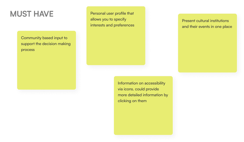
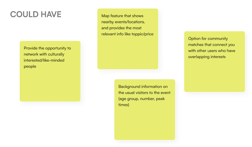
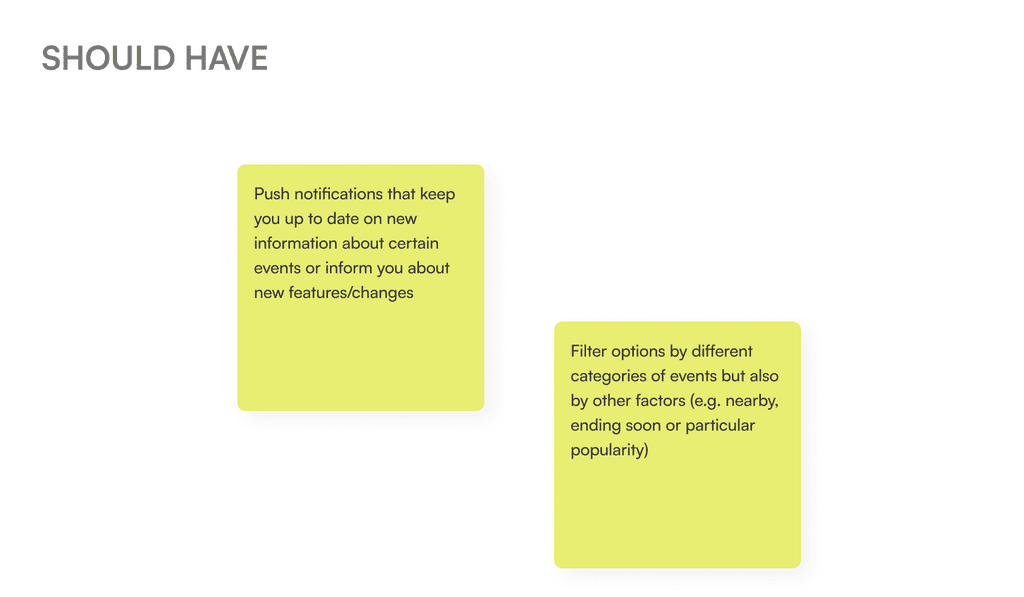
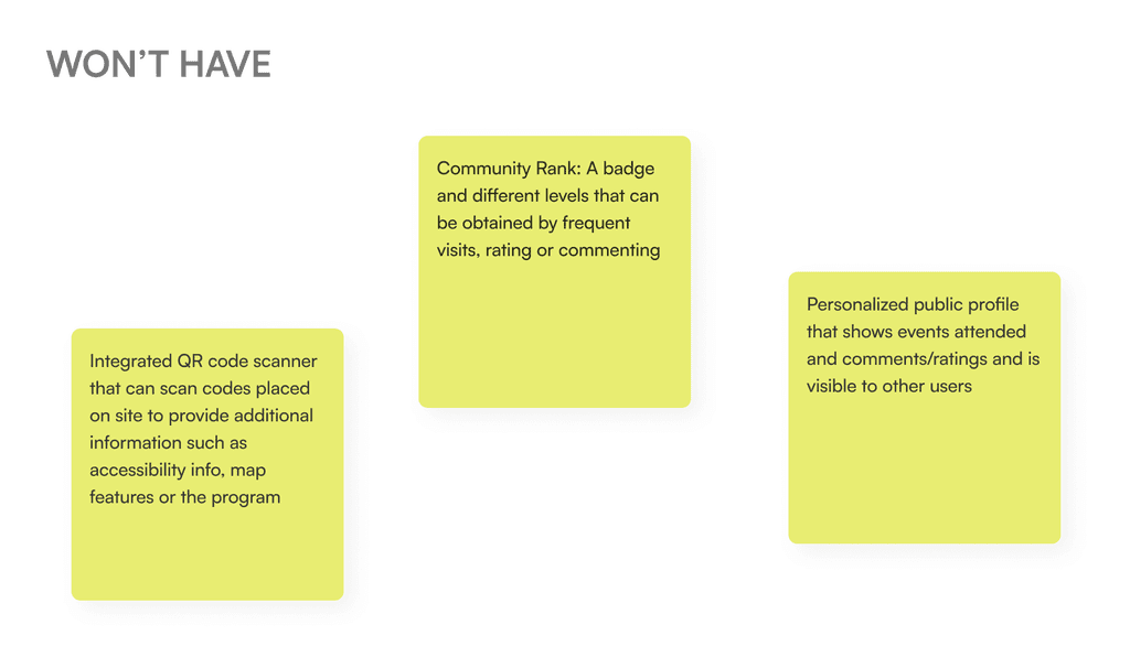
Utilizing the MoSCoW Method, we categorized the most pertinent ideas and features into four distinct groups: Must Have, Should Have, Could Have, and Won’t Have. This classification process helped us prioritize and allocate resources based on the importance and feasibility of each feature.